Graphing Construction on Tram Line 6 in Budapest
June 30, 2020
In this article I explore a method to visualize linear spatial data that changes over time: which segments of tram line 6 of Budapest were under construction at which points in time? This investigation is inspired by a video posted on Index.hu and a 140-year-old train schedule diagram.
This article was originally posted on Nightingale, the Journal of the Data Visualization Society.

The first electric trams in Budapest started service in 1887 on the Grand Boulevard. This segment later became part of Line 6 and its sister Line 4, which follows the same route except for the last two stops. Combined, they are the busiest tram lines of Europe. For 10 years, they were served by the longest passenger trams of the world — only to be surpassed by another line in Budapest.
Replacement buses
Someone taking these trams in Budapest does not ponder these historic facts when traveling on the line. No, she thinks about something else: the feeling that there is yet another construction project going on on some segment of the line, so she needs to take the tram replacement bus. Again.
As school holidays start, work is starting again on the line as well. This inspired some journalists at index.hu, the largest news site in Hungary to create a video showing a map of the line over time, highlighting each segment during the months they were renovated. Although the text in the video is in Hungarian, the main message comes across regardless of language: during a given month, segments that are undergoing works are shown in red.
Readers can also vote about how they feel regarding the topic: 61 percent said that they think that there are too many construction works and there should be a way to build a tram line without needing to repair it all the time.
Two minutes and thirty-five seconds and a time-space graph
The video linked above is 2:35 long. I did not watch it to the end at first as it gets rather bland after a while. This was true even though the creators sped through months without construction works. This speed change, in my opinion, actually skews the message — much more of the video is spent showing construction works than the relative time they actually took during the past 20 years.
Although the video did not keep me engaged, the underlying data did. I remembered the famous train schedule diagram created by E.J. Marey in the 1880s. This is a really clever way to pack a lot of information into one chart (although it might take a moment to fully understand it). The horizontal axis shows time, the vertical axis shows space. As time passes (we move to the right on the horizontal axis), trains move up or down (on the vertical axis), showing the progress of their journey between Paris and Lyon.

Marey, meet tram line 6
After this figure popped into my mind, it was not hard to come up with a way to use this approach to visualize tram renovations. I keep time on the horizontal axis, but instead of one day, I plot 20 years; the vertical axis remains a proportionally spaced diagram of the stops along the line.
Therefore, I watched the video again and took note of each construction event, measured the distances between stops on OpenStreetMap, and finally wrote a couple of lines in Python (available as a GitHub Gist) to visualize it using the Matplotlib package.
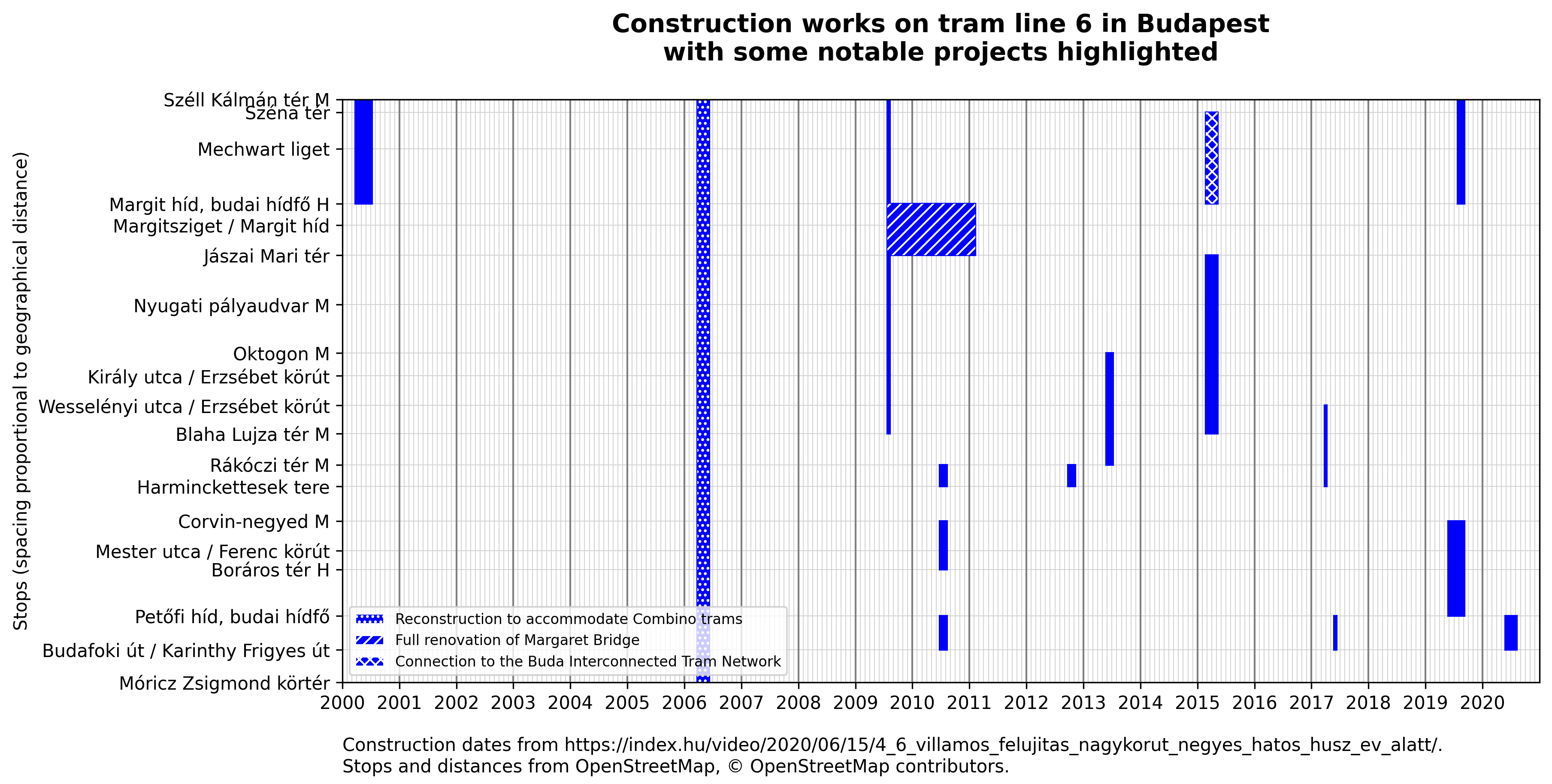
Some construction works in the video were annotated in more detail than others. I highlighted three of them as they were the most notable ones:
- In 2006, the whole line was rebuilt to accommodate for the (then) world record length and relative wideness of the new Siemens Combino trams.
- Between 2009 and 2011 Margaret Bridge, a bridge on the Danube was closed down due to a full reconstruction.
- The line was connected to the Buda Interconnected Tram Network in 2015, which meant that instead of a completely separate service, the segment between stops Széll Kálmán Tér M and Margit híd, budai hídfő H are now shared with tram line 17.

One diagram, many insights
Looking at this diagram takes significantly less time than two minutes and thirty-five seconds. You can still see which segments were renovated when — but not just for one month at a time but the whole twenty years.
Additionally, it provides insights that are not so easy to derive from the video.
For example, by looking at the full width of the diagram, you can see that the segment between Margit híd, budai hídfő H and Széna tér underwent works five times in the past twenty years, whereas the ones between Corvin negyed M and Harminckettesek tere and Móricz Zsigmond körtér M and Budafoki út was only touched once.
It is also relatively easy to gauge the length of each project: you can see that the renovation of Margaret Bridge took almost two years, whereas a typical project is around 2–3 months.
Or, if you pay attention to the year dividers, you can see that works are more likely to be scheduled during school holidays (from mid-June until the end of August) than other times of the year — with the exception of the multi-year bridge reconstruction project, no works were carried out during the winter months.
Finally, you might also notice that the frequency of renovations is not terrible after all — although there are cases where the same segment underwent works twice within two years, much more time passes before a repeated renovation in the typical scenario. Also, let’s not forget that this is the busiest tram line in Europe, so some wear and tear are certainly expected.
Final thoughts
While I enjoy watching videos, they might not always be the best way to convey information. Adding the third dimension of time to the x;y coordinates of pictures might be useful when we want to show how something evolves over time. However, if we care about snapshots, not the evolution of something, a static image might be easier to digest — and might give more insight.
I really enjoyed producing this diagram, especially since I got real, useful results in a short period of time. Feel free to let me know what you think about it!